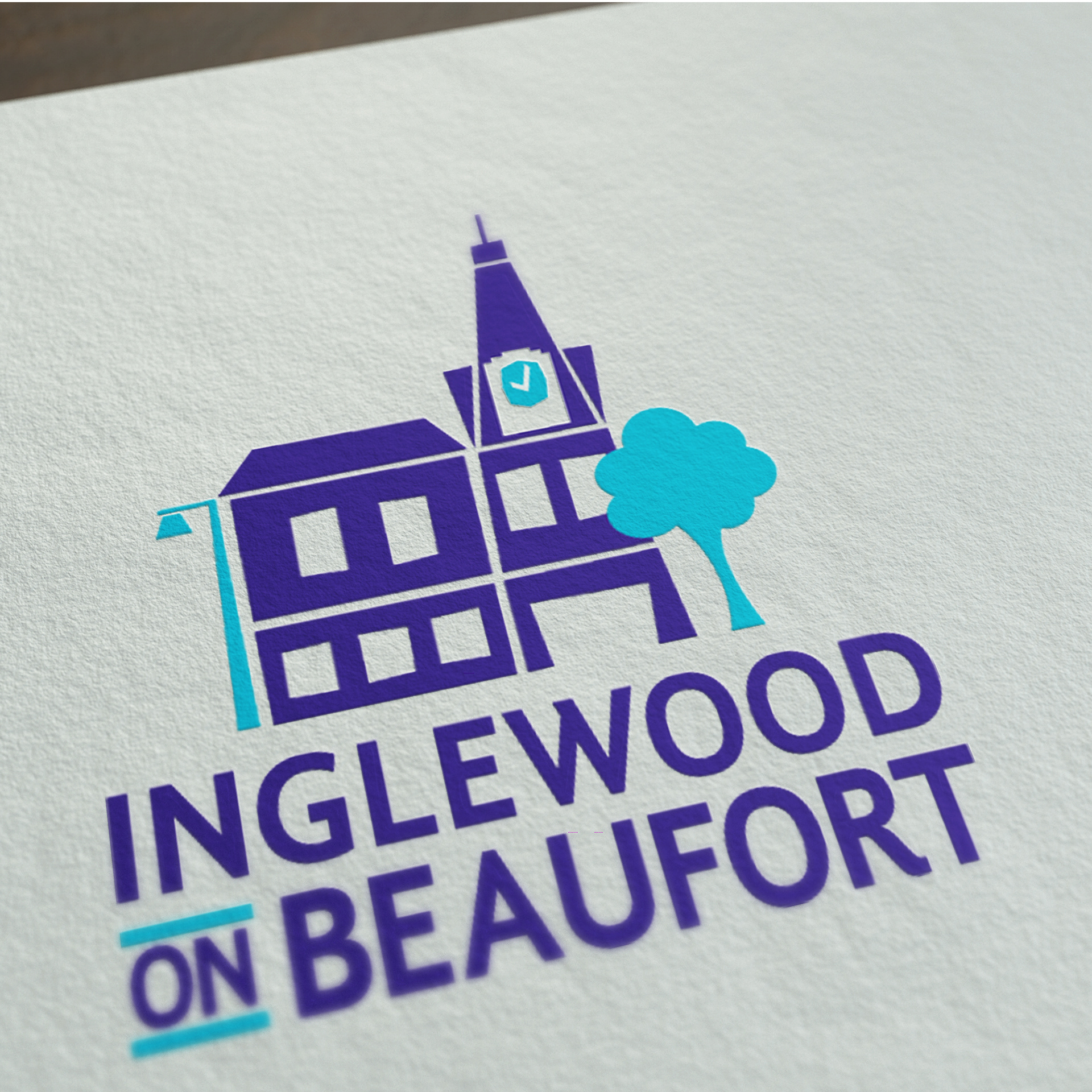
A community based group with an aim to improve their local area.
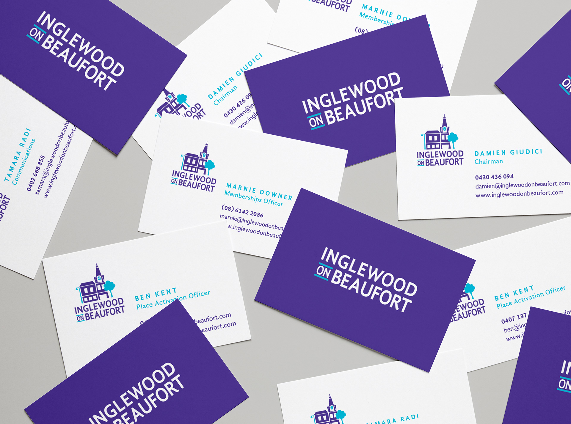
The branding is friendly and approachable but businesses would take away the professionalism behind the company. The area has a local landmark, a clock tower and that symbol is integral to the design. The illustration style is graphic with a bit of quirk to reflect the area's eclectic nature.
The colourways are based on the local Jacaranda trees, which have a lovely purple flowers in Springtime, and the turquoise is based on the beautiful Perth sky.
ART DIRECTION | ILLUSTRATION | TYPOGRAPHY | CONSULTATION | GRAPHIC DESIGN